Data Source
The models are trained using the
OASIS2
dataset
which is using the
Nifti
dataset format for the scans.
Labeling
For the labeling of the testing data we are using the
demographics information
that is part of the OASIS3 dataset. We have three main
categories of
subjects that contain those that:
- Remained healthy
- Became Demented after entering healthy
- Entered the system while demented
Subject Counts
| Total number of Subjects |
1093 |
| Remained Healthy |
659 |
| Developed Dementia |
74 |
| Total Number of Scans |
7588 |
| Distinct Days |
2496 |
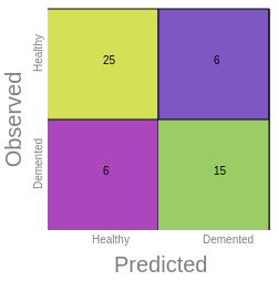
Confusion Matrix
Provides the accuracy of the model as the percentage of
times our model made the right prediction and it's
broken down into four parts:
- True Positive (TP)
- True Negative (TN)
- False Positive (FP)
- False Negative (FN)
In the above example we can notice the following:
- True positives (TP) are 25, which means the model
correctly
identified 25 instances as positive.
-
True negatives(TN) are 15, meaning the model
correctly
identified 15 instances as negative.
-
False positives (FP) are 6, which means the model
incorrectly identified 6 actual negative instances as
positive.
-
False negatives (FN) are 6, meaning the model
incorrectly identified 6 actual positive instances as
negative.
So, the model was right 40 times (TP + TN) and wrong 12
times (FP + FN).
Accuracy
The accuracy of the model can be calculated as the sum
of True Positives and True Negatives divided by the
total number of instances.
In this case, it would be (TP
+ TN) / (TP + TN + FP + FN) = (25 + 15) / (25 + 15 + 6 +
6) = 40 / 52 = ~0.77 or 77%. This means the model
correctly predicted 77% of the instances.
Precision
The precision or Positive Predictive Value can also be
calculated. It's the proportion of predicted positives
that are actually positive.
In our example that would be TP / (TP + FP)
= 25 / (25 + 6) = ~0.81 or 81%. This means when the
model predicts an instance to be positive, it is correct
81% of the time.
Recall
The recall or sensitivity, which is the proportion of
actual positives that are correctly predicted by the
model.
In our example it can be calculated as TP / (TP + FN) =
25 / (25 +
6) = ~0.81 or 81%. This means the model was able to find
81% of all positive instances.
Specificity
The specificity, which is the proportion of actual
negatives that are correctly identified.
In our example it can be found by this formula:
TN / (TN + FP) = 15 / (15 + 6) = ~0.71 or 71%. This
means the model correctly identified 71% of all negative
cases.
F1
The F1 score is a way to measure how well a machine
learning model works representing the harmonic mean of
precision
and recall.
The F1 score provides a balance between precision and
recall.
A perfect value would be 1, and the worst value would be 0.
Precision
Tells us how many of the
model's positive predictions were actually correct.
Recall
Tells us how many of the actual
positives the model correctly identified.
In the above example, F1 can be calculated as 2 *
(Precision *
Recall) / (Precision + Recall) = 2 * (0.81 * 0.81) /
(0.81 + 0.81) = ~0.81.
It's important to remember that these statistics provide
different perspectives on the model's performance, and
the optimal values depend on the specific problem and
the costs associated with false positives and false
negatives.
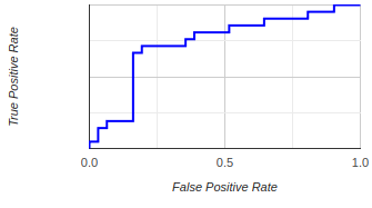
ROC Curve (Receiver Operating Characteristic Curve)
The ROC curve is a graphical plot
to evaluate the performance of a binary classifier
system as its discrimination threshold is varied.
It is
created by plotting the True Positive Rate (TPR) against
the False Positive Rate (FPR) at various threshold
settings.
The ROC curve is especially useful for understanding the
trade-off between correctly predicting positive
instances (TPR) and falsely predicting negative
instances as positive (FPR). It helps determine the
optimal model and the best threshold for classification.
A perfect classifier will have an ROC curve that passes
through the top left corner (100% true positive rate, 0%
false positive rate), and the area under the curve (AUC)
will be equal to 1.
The closer the curve is to the top left corner and the
greater the AUC, the better the model is at
discrimination. If the curve is close to the 45-degree
diagonal of the ROC space, it suggests that the
classifier has no better accuracy than random guessing.
Understanding how good or bad is a ROC curve
A Good ROC curve
Hugs the top left corner of
the plot quickly rising towards a high
True Positive Rate (sensitivity) with a low False
Positive Rate (1-specificity) and
then, it travels across the plot maintaining a high True
Positive Rate.
The closer the curve is to this top left corner, the
better
the model.
A Bad ROC curve
Conversely, a bad ROC curve is one that stays close
to
the diagonal line, also known as the line of
no-discrimination. This line represents a random
classifier (i.e., a model that does no better than
random guessing). If a curve is close to this line
or,
worse, beneath it, it indicates a poor model.
In summary, the further away the ROC curve is from the
diagonal line and the closer to the top left corner, the
better the model's performance.
Dataset Info
Each model is trained using its own distinct section of
all available data. Our aim is to distribute the MRI
features as efficiently as possible. We ensure each
patient's data is only found in one category, either
training, validation, or testing. This is critical as
some patients may have multiple scans, and having these
scans in different categories could lead to misleading
results and a false appearance of high performance.
Imbalanced Data Based on Healthy or Demented
We aim to keep the data for each category (training,
validation, and
testing) imbalanced.
This makes the model more realistic and helps
avoid 'overfitting', which is a problem where results
are exaggerated due to a certain modeling approach.
Balancing data could also skew results.
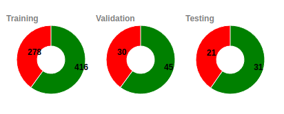
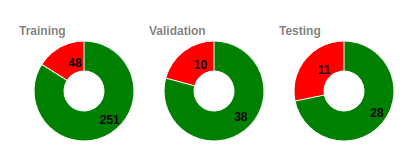
Unique Subjects
Since a subject can have more that once scans taken
during
different periods we have developed specialized
algorithms to
assure the maximum possible diversity in all the subsets
used
for training, validation and testing.
In the example that we see here we can see that for
the training set we are using 251 unique healthy
subjects (that they result to 416 scans) and 48
unique demented (that they resutl in 278 scans).
Similarly the valued for the valiation are 38 - 10
(45-30) and 28 -11 (31-21)
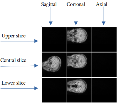
Selected Slices
From each MRI scan, the slices that are
useful for the model come from a specific set. This set
includes the three middle slices and two slices from either
side of the middle. Therefore, the maximum number of
applicable slices is nine. However, we can use any
combination of these slices, and we have the potential for
2^9 (or 512) different combinations.
To help visualize this, we've provided a sample image
that
presents the nine possible slices. In this image, the
slices
that aren't being used are left blank, while the slices
that
are being used have sample data on them.
In the example image, the model takes an array of slices
from the MRI as input. Specifically, we are using five
slices: one middle slice for the sagittal view, and
three
slices - top, middle, and bottom- for the coronal view.
It's
worth noting that we aren't using any slices from the
axial
view in this example.
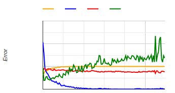
Training History
A graphical representation of a classifier's training
includes:
- accuracy
- loss
- validation accuracy
- validation loss
Accuracy reflects how often the model makes correct
predictions.
Loss tells us how far off these predictions are.
As training progresses, we ideally want accuracy to go
up and loss to come down.